This makeup journey has been a lot of fun. I love it. I was all about color, shimmer, and glitter when I started. I'm still about color, glitter, and shimmer. But now, I have a much better appreciation of structure and the architecture of a look. And I've learned that structuring the face and the eye can only help the color and shimmer effects look better.
While still using the boutique brands (such as Sugarpill) that I fell in love with initially, I've come to rely more and more on pro brands. In the beginning, pro palettes just mystified me. But as I've learned more about color and shape, I now appreciate the structure and organization that they represent and can understand why the professional makeup artists I've met adore them.
I'm going to take a few makeup palettes from my current favorite professional brand, Viseart. There is a logic to the arrangement of the colors, and if you understand that, you can better understand how to use them.
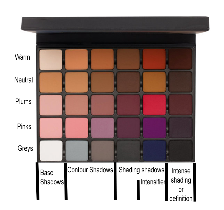
One of the most successful makeup pallets in history is the Viseart Neutral Matte palette. Introduced in the mid-90s, it remains their best-selling palette. They are so popular and relied on that pro makeup artists will often have two or three of them in their bags to ensure they never run out of them. Here's a picture:

I've added color descriptions to this. You can see the arrangement: The top row gives the base shade for the person you are working on. You would start with these shades, laying down a base over the eyelid up to the eyebrow. The lower two rows' shades are essential shades of brown, grey, and taupe. Use them as is, but mixing them is more common. For example, combine the chocolate brown with the sienna to get a warm reddish-brown, darken the soft taupe with the deep grey, etc. Once you understand the almost infinite possibilities provided by this palette, the sky is the limit. You can do smokey eyes, a nude eye, you can age your actors. The possibilities are unlimited. It is no surprise that this palette has become so influential.
A later Viseart palette builds on this model by introducing warm mattes:

Once again, these are not just a random selection of colors. They are chosen and arranged to make sense to the makeup artist. Like the neutral matte palette, the first three columns reflect different skin tones. In the far right column are the familiar skin undertones. Understanding this, you could build a look for a fair-skinned person using the three colors in the fair-skin column. You can place the top color on the lid, the middle color in the crease, and the bottom color in the outer corner to give the eye structure. (Of course, many other looks are possible, this is just an example). And you could intensify this look by mixing in the appropriate undertone from the far right column.
One of the most unusual and exciting palettes Viseart has introduced deals exclusively with eyebrows:
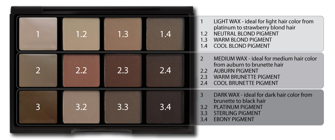
As you can see, in this palette, rows correspond to hair color. The ingredients in the first column are colored waxes, not shadows. You can use these waxes to fill sparse areas in the clients' eyebrows. Then you would select an appropriate shade from the same row to fill in the brow. Rather than use wax, I prefer to use a pencil because it looks more realistic. With a pencil, you can use short strokes to simulate the look of natural hair. But I always finish with shadows, and having these particular shadows available is lovely. Eyeshadows are too pigmented to make a genuinely realistic brow, but this palette's shades are just right.
The tremendous success of these and the other Viseart palettes have led the company to take a chance on more ambitious palettes. Initially announced as special editions, they are so popular they are now considered part of the company's core collection.
The first, called the Grande Pro Volume 1, is a greatly expanded version of Viseart's matte palettes.
Each row has a different undertone, with many more undertones in this palette. It is hard to imagine a situation where you couldn't find a color match for any person from any location in the world with this palette! And as you can see from the picture, moving to the right, each color grows deeper, with its suggested functions given below the palette.
The next palette, the Grande Pro Volume 2, is a real departure for Viseart. It's a texture palette with every column containing a different texture.
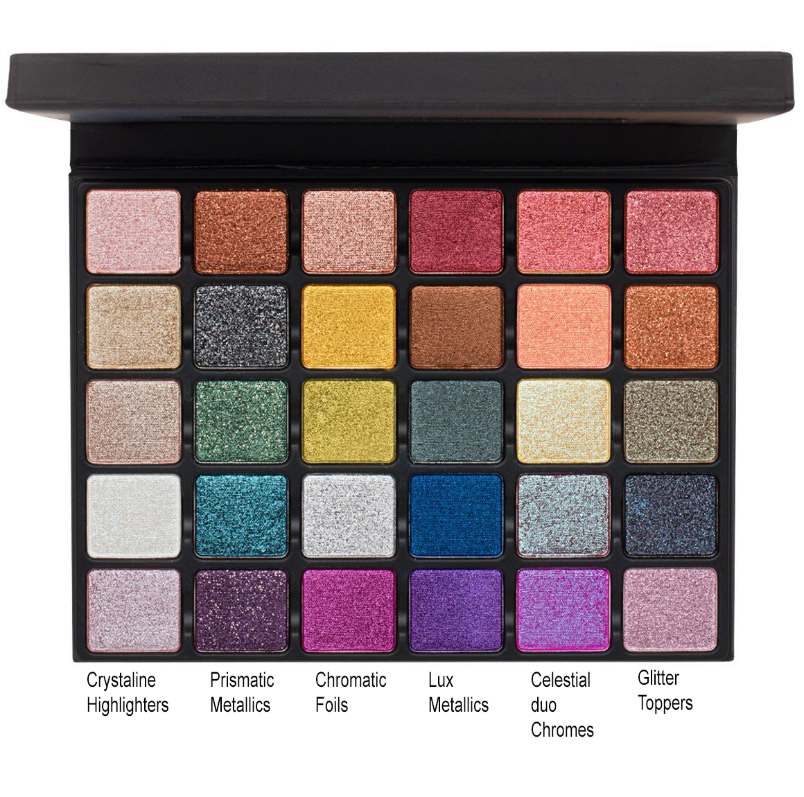
I will touch on a few key points. The prismatic-metallics are a form of liquid metal. Use them as is or, to significant effect, with a transformer. Many companies sell transformers, including Viseart. I favor Inglot's Duraline.
Neither the chromatic foils nor the lux metallics have glitter or particles. The lux metallics are a vibrant form of a traditional makeup look.
The 5th row contains duo chromes. Duo chromes are particles with different colors on each side that allow light to pass through them. The effect is similar to a butterfly's wing. You can see different colors from the same object depending on the angle of the reflected light. Use with or without a transformer.
The sixth column is for creating significant glitter looks. A transformer will help avoid the fallout from these major glitter shades.
For our final example, we take the newest palette, the Grande Pro Volume 3. It's a wonderfully colorful palette and remarkably complete. It is possible to do a full makeup look using only this palette.
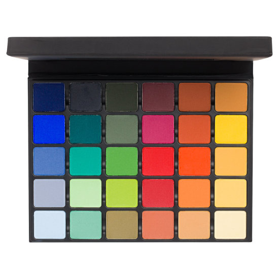
It is organized based on color theory. The first three columns are cool colors, while the right three columns are warm colors. The rest of the rows are combinations of the three primary colors (Red, Green, and Blue) in their secondary and tertiary forms. To understand this palette completely, I suggest looking at a color wheel and reading about color theory.
I hope this quick look at several pro palettes has helped you understand how vendors arrange their pro-makeup products. There is a logic to every pallet. Whether or not you would want to purchase them is another question. Viseart also has consumer-level palettes. These are less complex, with many fewer choices. It makes sense: pro-Artists must deal with many skin tones and eye colors. Commercial pallets contain a subset of these colors that will work well with specific eyes or skin tones. That way, consumers can buy just the colors that will work for them. The consumer palettes will also mix matte shadows with shimmer and glitter shadows, which you will never find in pro palettes. (Photographers object stringently to the slightest speck of glitter when it is not wanted. Mixing shimmers with mattes could cause contamination, which is not a terrible thing in a consumer palette, but a disaster in a photo session).
Even though we have focused on pro-palettes, consumer palettes have similar organizing principles. Look at some of your palettes and see if you can discover why those colors were selected and arranged.
I hope this was helpful! Send me questions, comments, or anything friendly anytime!